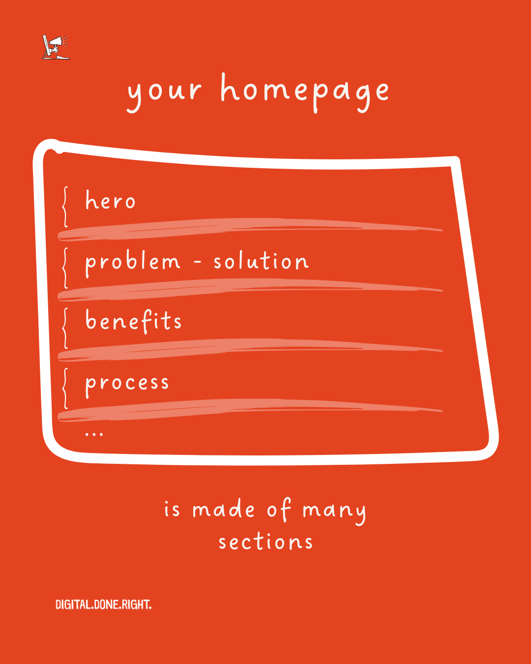
The Anatomy of a Client-Generating Website
🇩🇪 Lieber auf Deutsch? Klick hier
This is part 2 of a 6-part series on building the best website for your service-based business. Make sure to check out the previous chapters!
PART 2: THE ANATOMY OF A CLIENT-GENERATING WEBSITE
Before I break down for you what you need to have on your website, let me ask you, do you have one? I ask this because a photographer I worked with was in this position. She only had an Instagram account. She knew a website was probably an important thing to have, but it wasn't high on her list of things to do.
YOU NEED A WEBSITE.
You could be successful on social media. Remember, I'm not talking about influencers here, I'm talking about you, a business providing a service. The number of followers you have is not a metric that means much. How many leads can you generate?
Remember, you are building on borrowed land. You don't own your social media account. We don't have to go back that far. Just look at Twitter. It collapsed almost overnight. Well, it still exists, but its value has plummeted. That could happen to your social media success. So you need land that you control - a homepage.
Now that we have established that you need a website, the question is what should be on it.
YOUR WEBSITE IS NOT FOR...
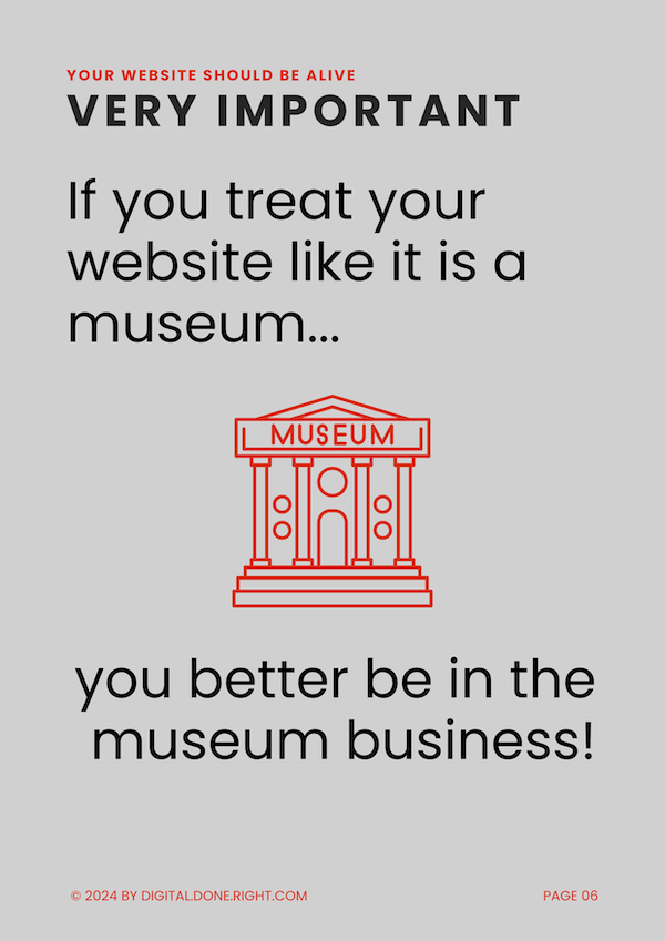
I had to include this because I had this conversation with a client not too long ago. Your website is not a vanity project.
It is not your museum. It is not for you.
It is for your customers.
Only if your site provides value to visitors is it useful. Assuming that just anyone who comes to your site will be happy with you and happy to leave their details is a mistake and a missed opportunity.
"I WANT MORE SERVICE-BASED COMPANIES TO BE SUCCESSFUL WITH THEIR ONLINE ACTIVITIES!"
WHO IS YOUR SITE FOR?
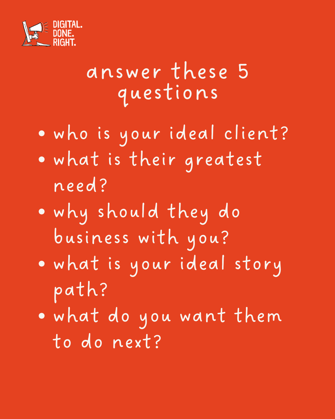
You need to understand that 96% of website visitors do not come to buy. They are looking around. Your website needs to give them something they want. You must understand who your website visitor is. You need to understand the needs of your website visitors.
You need to think about this before you design your website. Just making your website the way you want it will not lead to the results you were hoping for. Let's look at a small example in the next section.
WHAT IS A ‘Client-GENERATING’ WEBSITE?
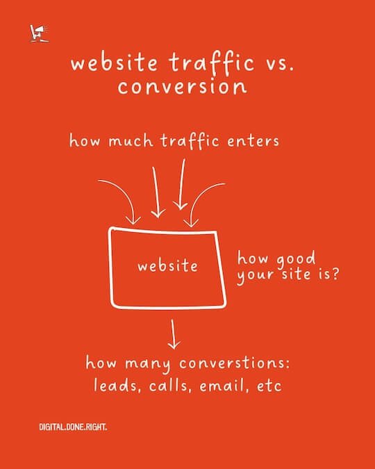
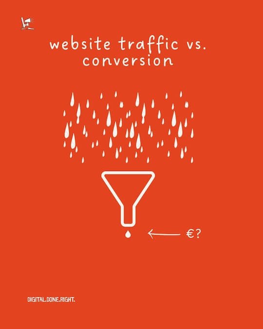
Good websites attract visitors. The more visitors, the better, right? Well, since you are in the service industry, just having people come to your site is nice, but it does not pay the bills. We have to turn them into customers. This is a process called conversion. We have to turn them into customers.
The service companies I work with do not sell through their websites. Some have pricing, and one has an online calculator to estimate the cost. All of them close the deal with a quote. That happens off the website.
The conversion we are looking for is to get the visitor interested enough to leave their contact information. This can take many forms:
Scheduling a call
Submitting email details
Downloading information after leaving details
Download a free guide ‘5 Biggest Digital Marketing Mistakes Service-Based Businesses Make - and How to Avoid Them’ (see what I did there?)
By generating leads, I mean converting a visitor into a potential customer. With a well-designed website, this can happen automatically. Generating traffic to websites is important, but if it does not convert, then it is just for show.
How to design a customer-generating website? Let’s get started!
WEBSITE Conventions
Before we begin designing your homepage there are a few items you should be aware of. I know some of you run small businesses and will build your website yourself or have a friend do it. Others might spend some money and have another person do this for them.
If you are not building your website yourself, skip this section.
It doesn’t matter but there are “rules” that need to be followed. I say followed but that is not a hardened rule. All rules in design can be broken. Breaking too many will turn visitors off and they will leave.
Website design conventions are a set of established guidelines and practices that are commonly followed when designing a website. These conventions help ensure that the website is user-friendly, visually appealing, and easy to navigate.
Here are some key website design conventions:
Left-to-Right Reading:
People generally read text from left to right, so it's important to follow this convention when laying out your homepage's content. This means placing your most important elements, such as your hero section and call-to-action buttons, on the left side of the page.
Content Hierarchy:
Create a clear hierarchy for your content by using different font sizes, colors, and styles. This will help visitors quickly identify the most important information on the page. Use large headlines for key messages, medium-sized text for body copy (fancy word for text), and small text for secondary information. Did you notice I am using bold headers here for these points? That is part of the hierarchy.
Font Sizes:
Use a variety of font sizes to create visual interest and make your content easy to read. Use large font sizes for headlines and key messages, medium-sized font sizes for body copy, and small font sizes for links and other secondary information.
Here is a site that I use to determine the size of the base font and others for a website https://typescale.com/
White Space:
Don't cram too much information onto your homepage. Use white space to create breathing room and make your content more visually appealing. White space also helps to focus attention on the most important elements on the page.
Contrast:
Use high contrast between your text and background colors to make your content easy to read. This will help older visitors and those with vision problems.
Check out this site if you want to test your colors for their contrast. https://webaim.org/resources/contrastchecker/
Consistency:
Use consistent fonts, colors, and styles throughout your homepage to create a cohesive look and feel. This will make your homepage more professional and recognizable. If you are designing on your own (like I do) then you really should have an account with Canva. I have a free account and it offers me all the features I need to create graphics, posters, Instagram carousels, and more. https://www.canva.com
If you are designing your color scheme for the website then this site can help you to match the right colors. https://color.adobe.com/create/color-wheel.
Accessibility:
Ensure that your homepage is accessible to people with disabilities by following these guidelines:
Use alternative text (alt text) for images: Alt text is a brief description of an image that is read by screen readers. It helps visually impaired users understand the content of the image. In addition to helping visually impaired users understand the content of an image, using alt text can also improve search engine optimization (SEO). Search engines rely on alt text to understand the context and relevance of images on a webpage.
Provide transcripts for videos: Transcripts provide a text-based version of the audio in a video, allowing users who are deaf or hard of hearing to access the content. If you have videos on your website, consider providing transcripts or captions for them.
TL;DR
This page discusses the importance of having a website for businesses and provides insights on what should be included on the website.
It emphasizes the need to understand the needs of website visitors and how to convert them into potential customers.
It also highlights website design conventions and the importance of accessibility.
👆🏻 Back to Top 👆🏻

